Good design is apparent
If you have to ask, it’s bad design.
Good design does the pre-work to know your context, and is intelligent and clear enough to give you one of two options. Each option chosen should have a clear action for the user, or should provide you more context on the user.
Spreading the audience’s mind across multiple possible options is ineffective. Of course, not everybody can take the happy path, but you should make the happy path as obvious as possible.
The original iPhone had great design. A couple buttons, and it was clear at any one moment what each of the buttons would do:
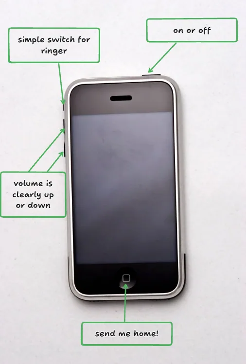
They were separated so you had to intentionally press each button. The volume triggers were clear. You could navigate with your eyes closed. Everything you touched was done with intention, and it was hard to screw it up.
Good design also concerns your writing and copy.
If users are asking “what does that mean”, either:
- They are the wrong users, and you should retarget
- They are the right users, and you are wrong in how you do copy
Bad design produces questions. It creates unnecessary surprises. Keep it simple, keep it obvious.